CLIENT
PRODUCT
PROTOTYPE
VIEW THE PROTOTYPE IN NEW TAB
(or click below to explore the embedded prototype)
CHALLENGE
I was tasked by NEM/Symbol leadership to reimagine the Symbol wallet and provide a superior experience for the community.
SOLUTION
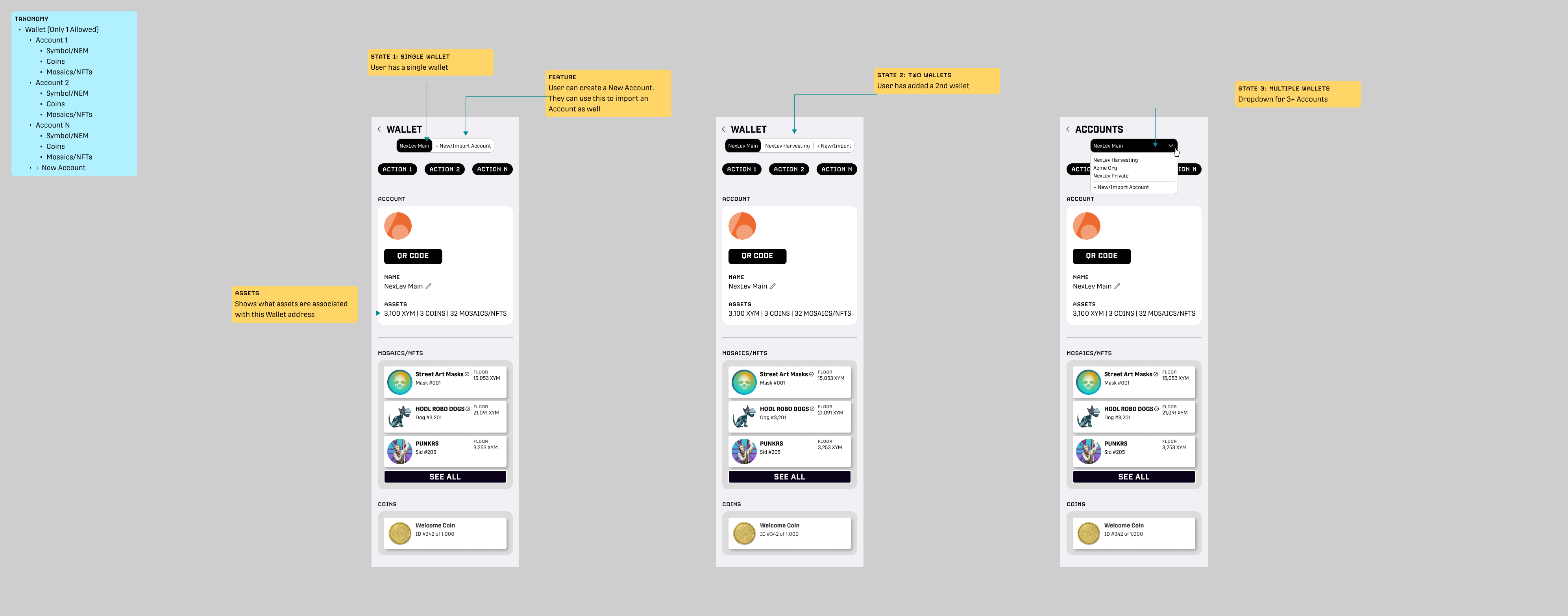
To start, I meet with all the stakeholders (CTO/core developers, engineering team, community members/users, and design colleagues) to gather the feature set and priorities. I then did a Competitive Analysis by reviewing best-of-class crypto wallets and even indirect competitors to understand better best practices, trends, and opportunities for innovation. I conducted further User Research and built initial wireframes (shown below). These wires were presented to the stakeholders and my team and then iterated. Once there was agreement on structure/features, I applied a Visual Design using a Design System I created.
VISUAL DESIGN
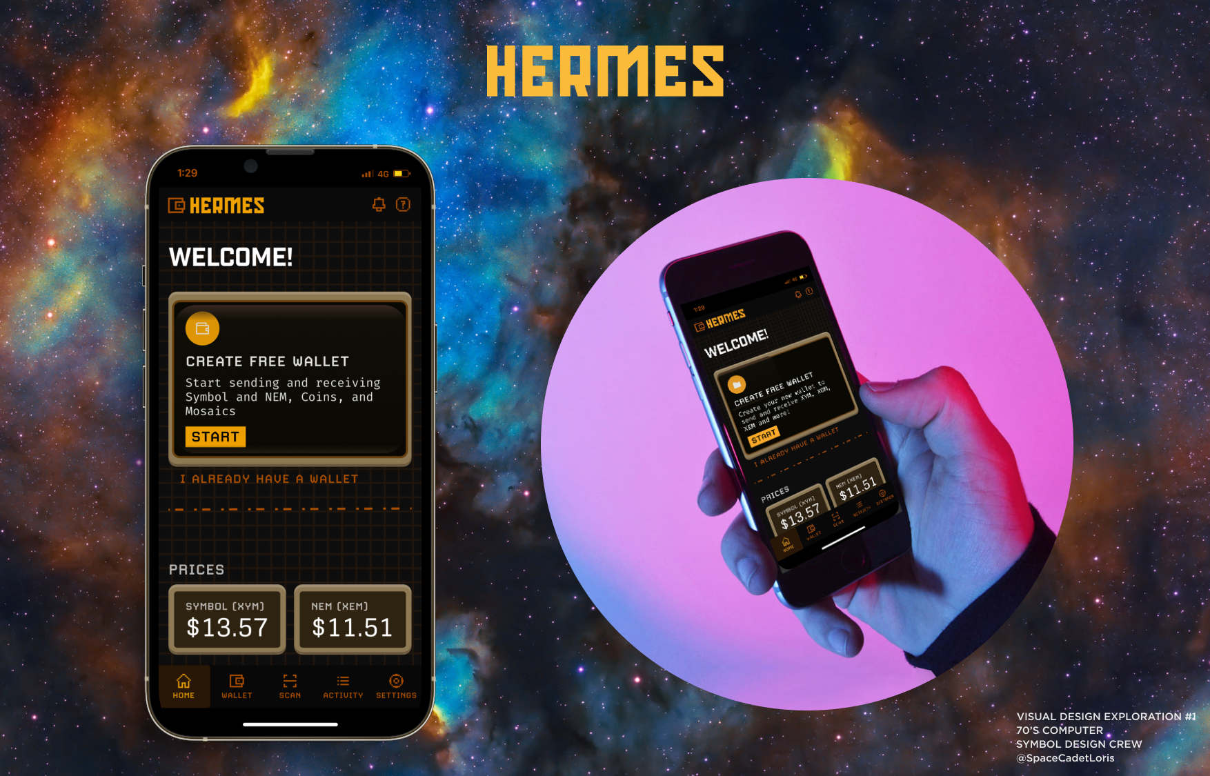
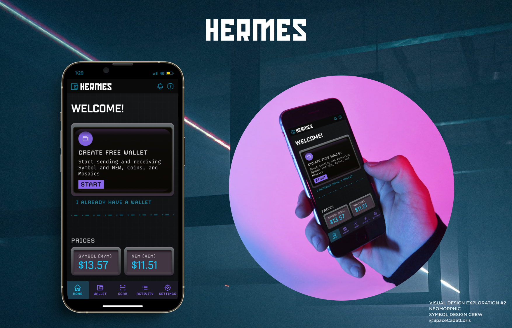
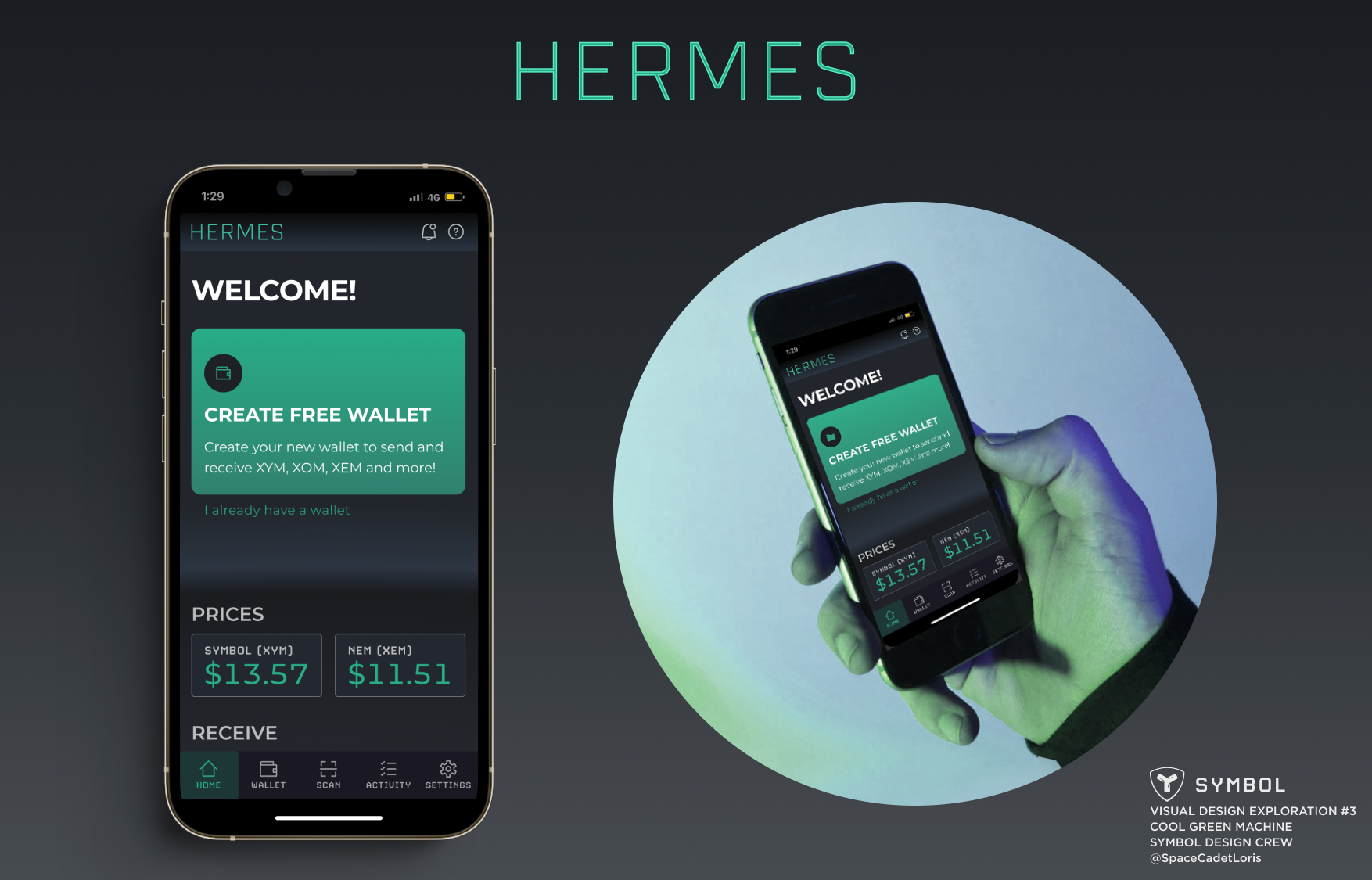
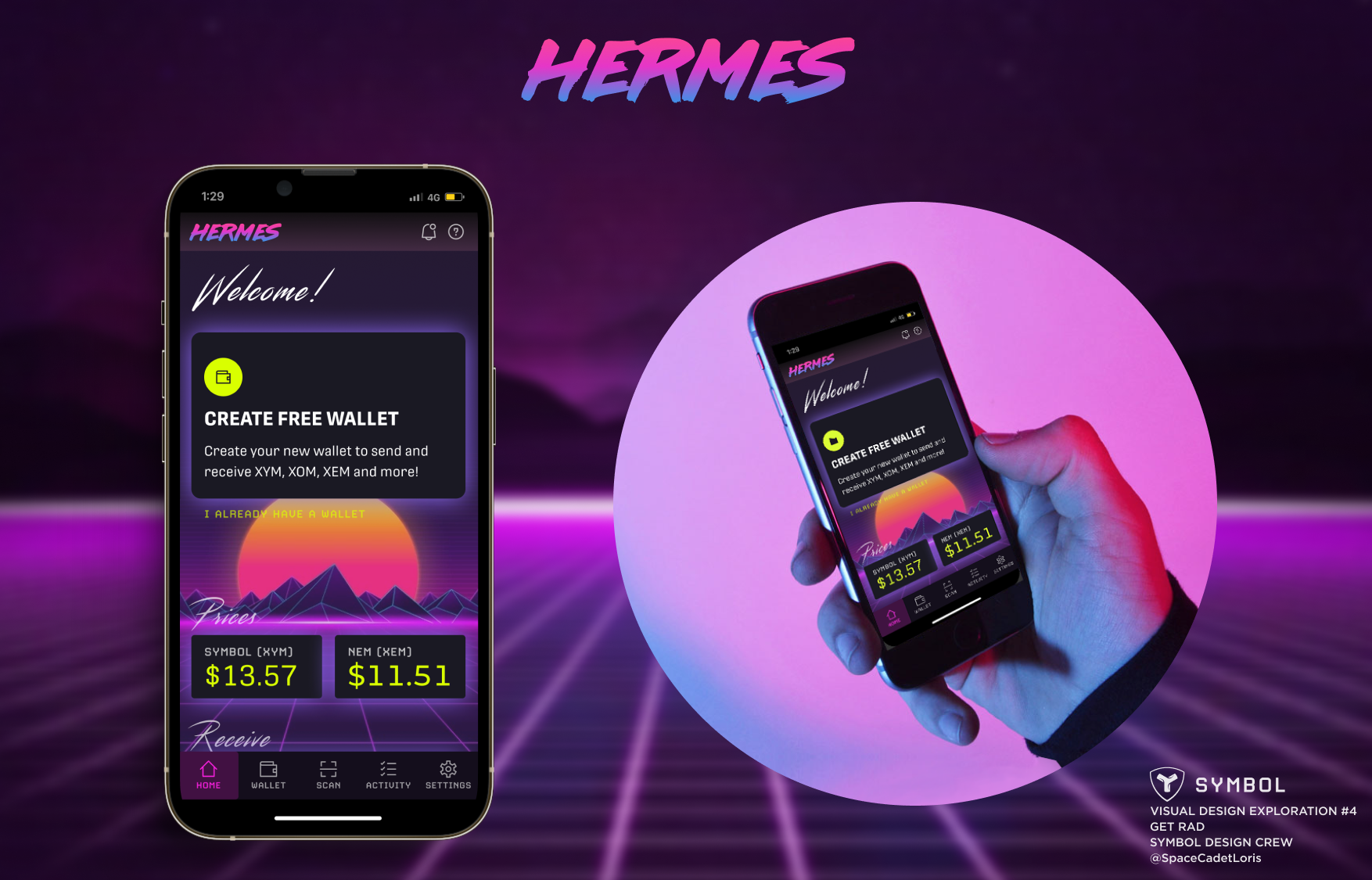
To build excitement in the community and to run a concurrent effort on design, I created numerous visual design directions to share with the community on Twitter for feedback and through other channels. Below are the concepts.
Concept #1: 70s Computer
Concept #2: Neomorphic
Concept #3: Cool Green Machine
Concept #4: Get Rad
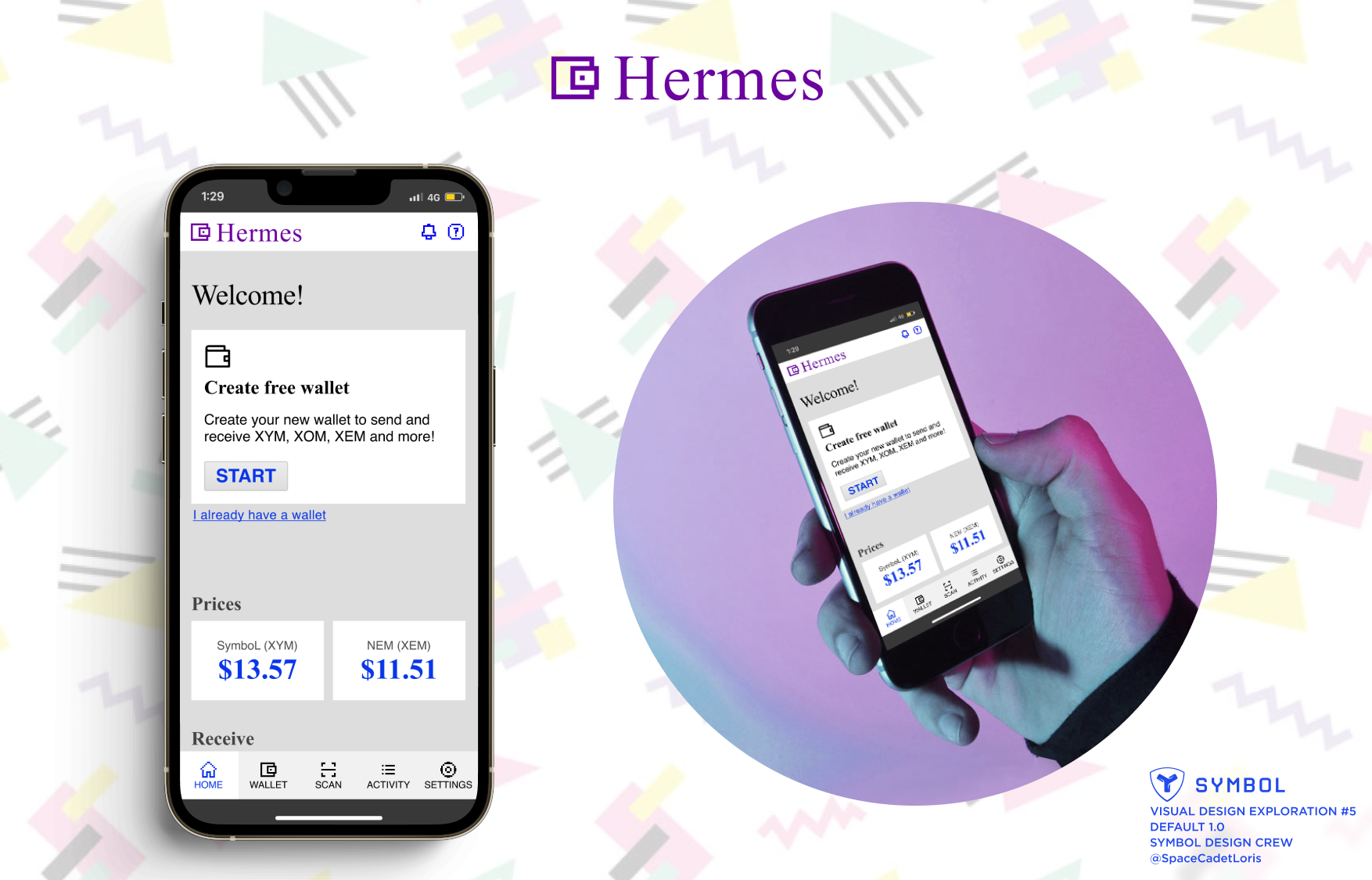
Concept #5: Default (Web 1.0)
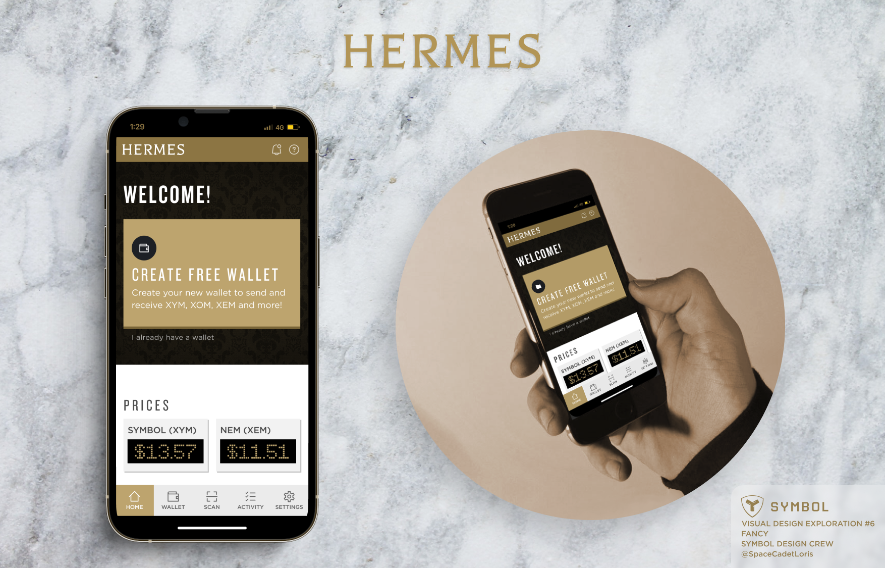
Concept #6: Fancy
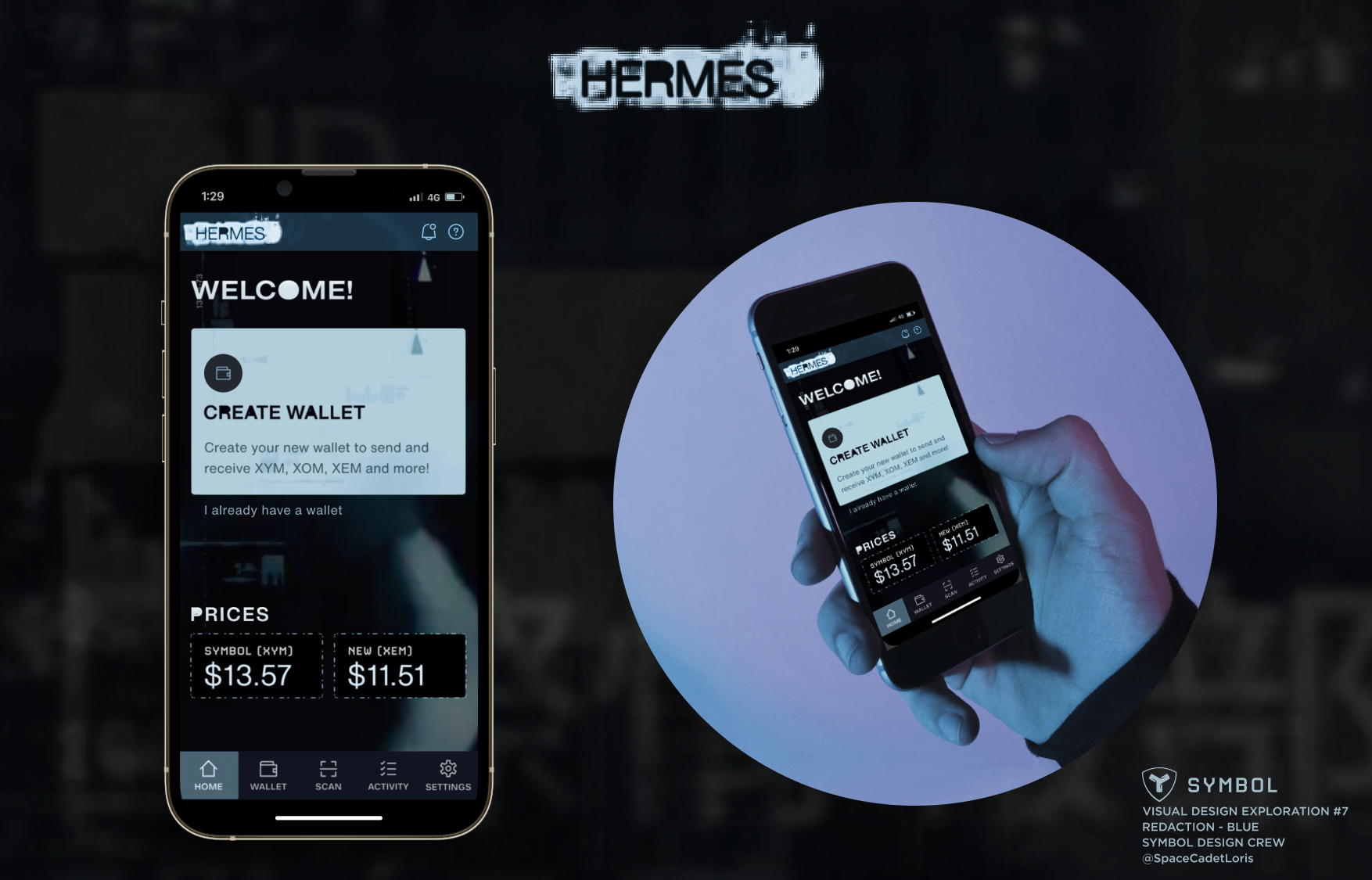
Concept #7a: Redaction – Blue
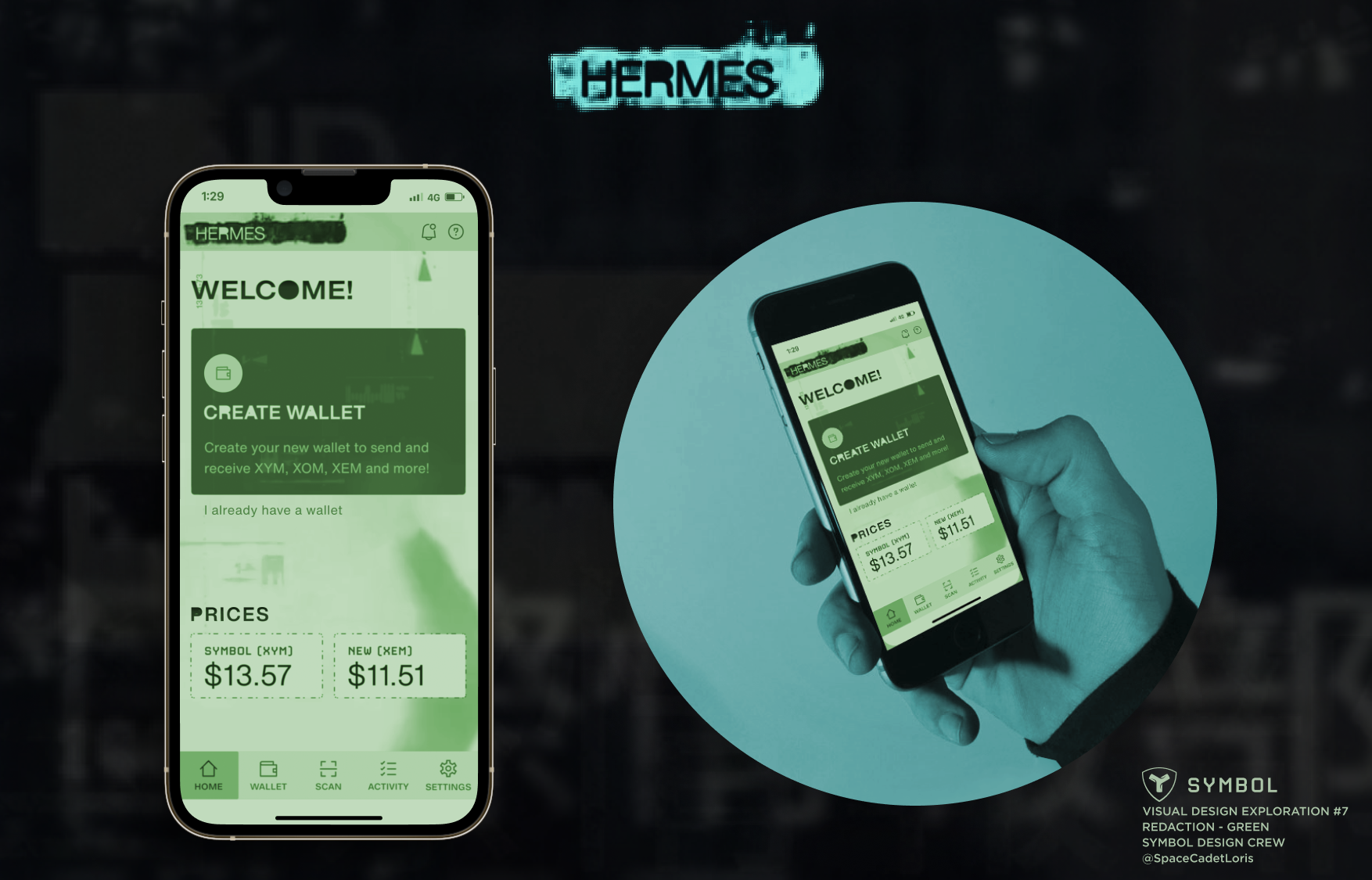
Concept #7b: Redaction – Green
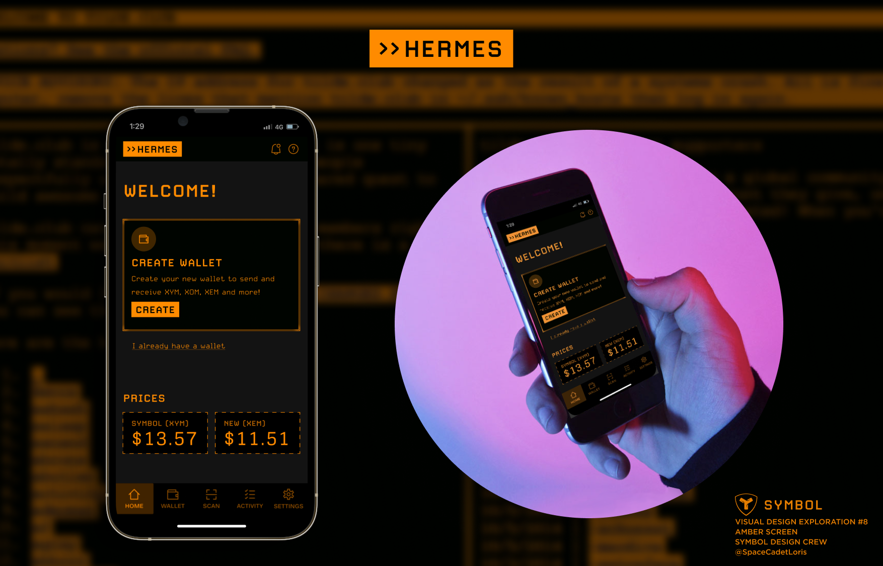
Concept #8: Amber Screen
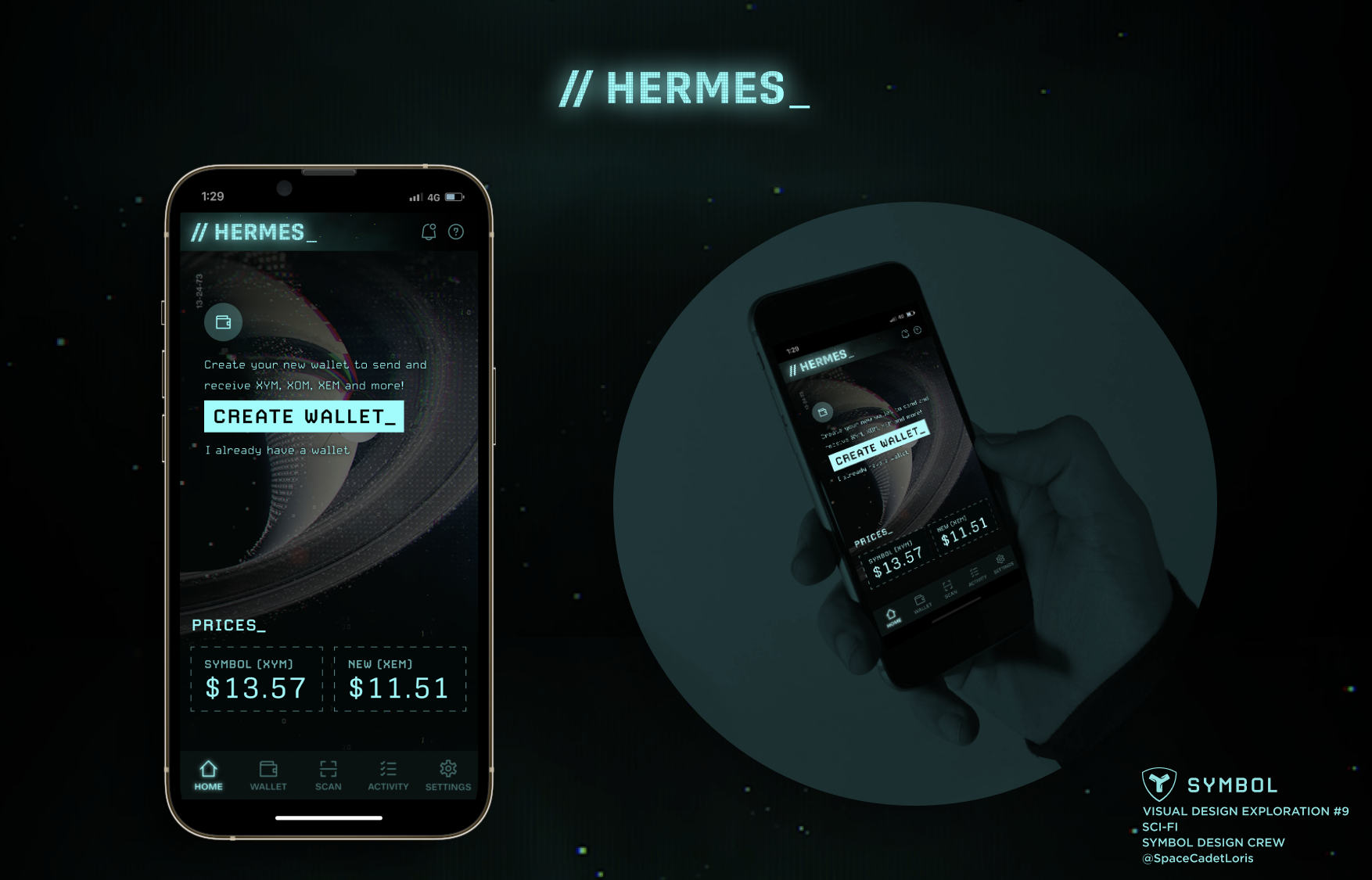
Concept #9: Sci-Fi
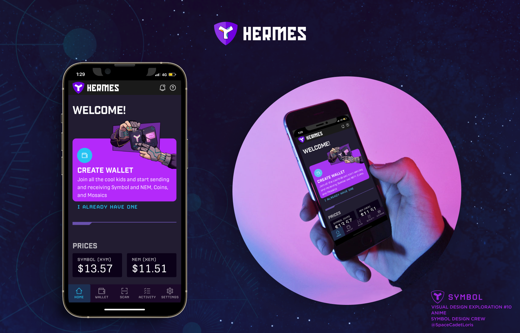
Concept #10: Anime
UX: WIREFRAMES: LO-FI
I first explored a concept where the user was allowed to create multiple accounts, which could contain multiple wallets.
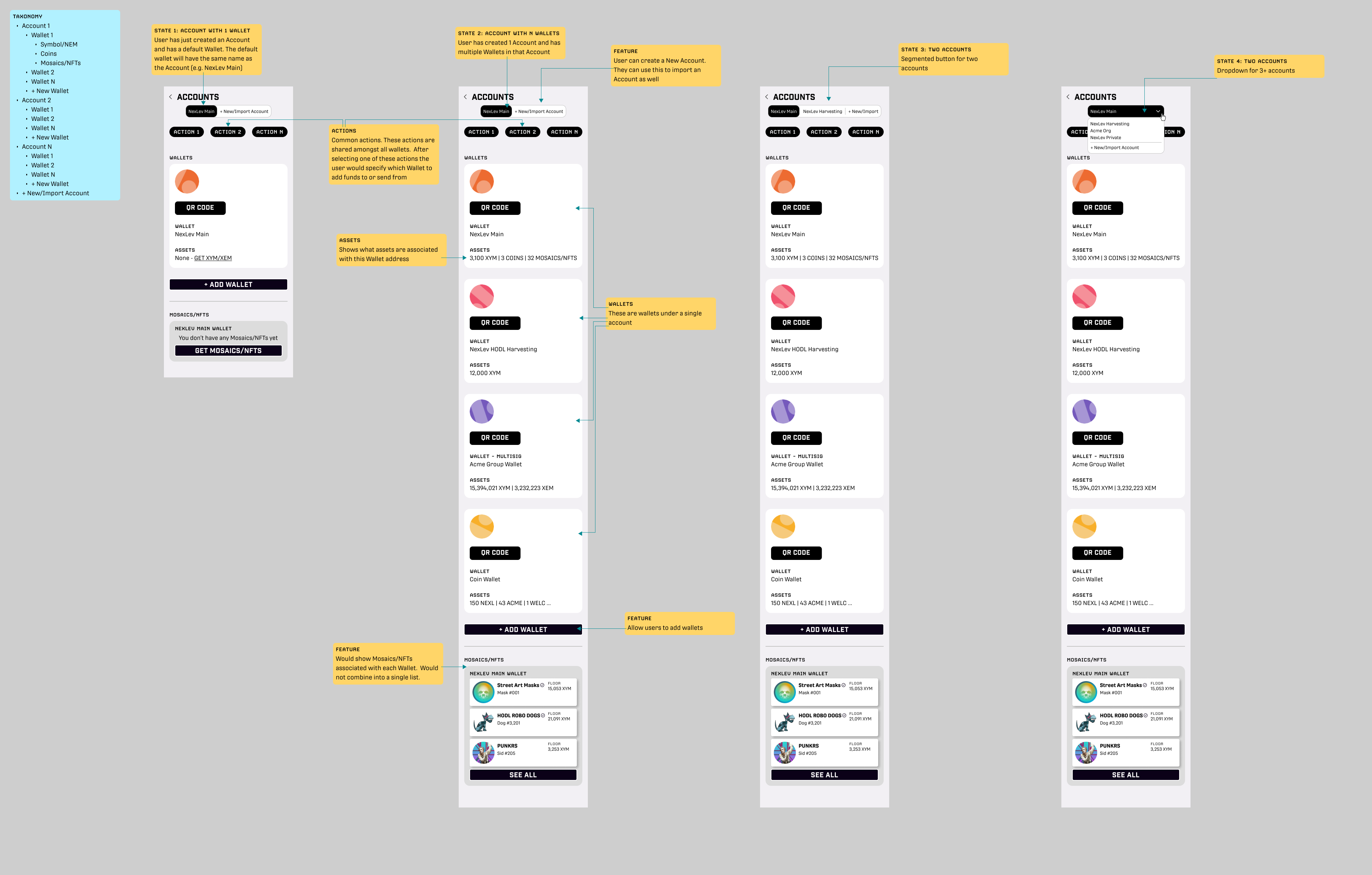
After discussion with the team, we decided to limit the wallet to multiple wallets and removed the account concept.
REFERENCE: LEGACY WALLET EXPERIENCE