Exploration of Neumorphism
ABOUT
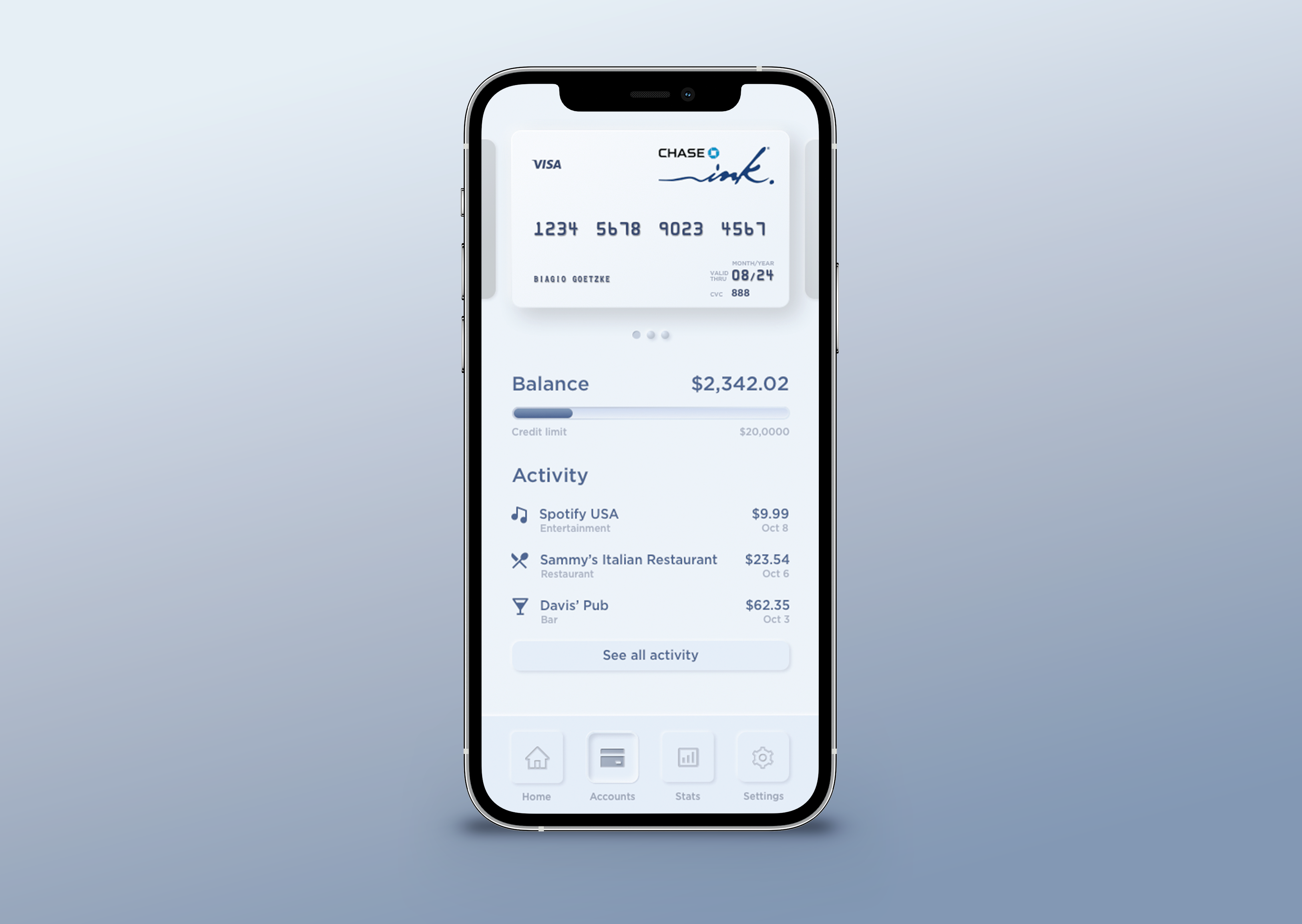
As one of my classwork assignments for my Learn UX Design course, the challenge was to design a list view for a personal finance app (details below). I wanted to not only explore effective Interaction Design but play with Visual Design. In particular, I was looking to explore Neumorphism as a design direction. Neumorphism is an evolution of skeuomorphism.
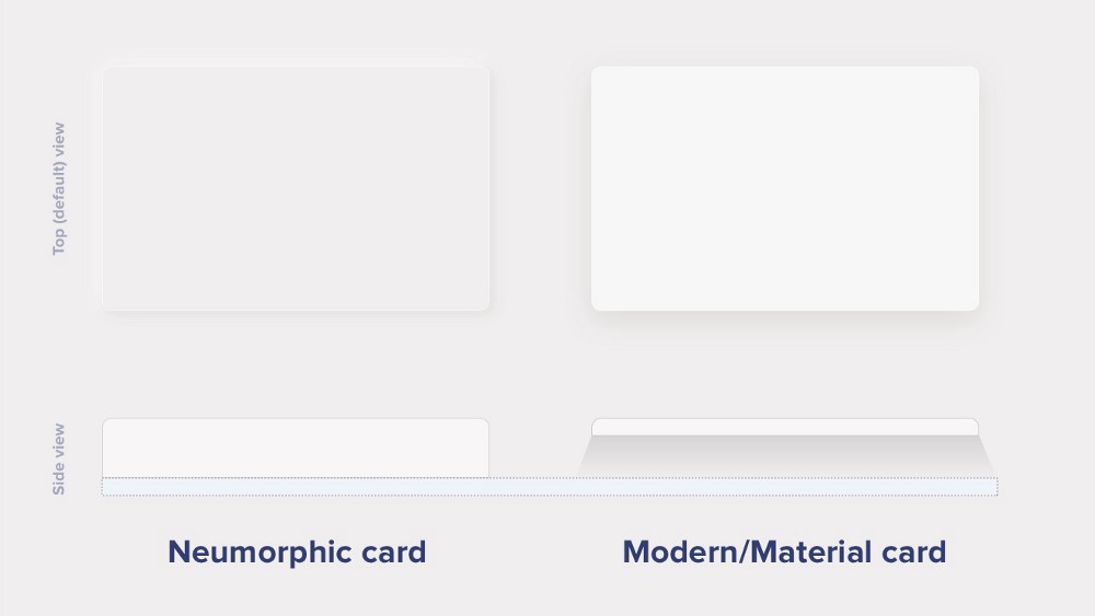
What’s the difference?

Modern / Material Cards
A Modern / Material card usually is a surface floating on top of our perceived background and casting a shadow onto it. The shadow both gives it depth and also, in many cases, defines the shape itself — as it’s quite often borderless.
Neumorphic cards
A neumorphic card, however, pretends to extrude from the background. It’s a raised shape made from the same material as the background. When we look at it from the side, we see that it doesn’t “float.” This effect is pretty easy to achieve by playing with two shadows, one at negative values while the other at positive. But for it to work, our background cannot be fully black or fully white. It needs at least a tiny bit of tint so both dark and “light” shadows will be visible. You can use any hue for the background to be warmer or colder, depending on your choice. But white and dark shadows have to be visible on it, if slightly.
CHALLENGE
- Design a list or table view of recent transactions in a personal finance app. The app can be for any platform you wish, but this view should be fairly powerful – allowing users some flexibility in viewing and getting actionable information from past transactions.
- For the list itself, think of what fields you want to display and what actions are available on each transaction.
- For the list controls, think of what sorting/searching/filtering might help fulfill reasonable use cases in a personal finance app like this.
- For the broader page, consider if any all-up stats on the transactions would be useful, e.g., a count or sum of recent expenses.

