CLIENT
![]()
ROLE
Product Design, UX/UI, Visual Design
TECHNOLOGY USED
Adobe CC, Sketch, InVision
PLATFORMS
Responsive web and native mobile application
DESKTOP PROTOTYPE
CHALLENGE
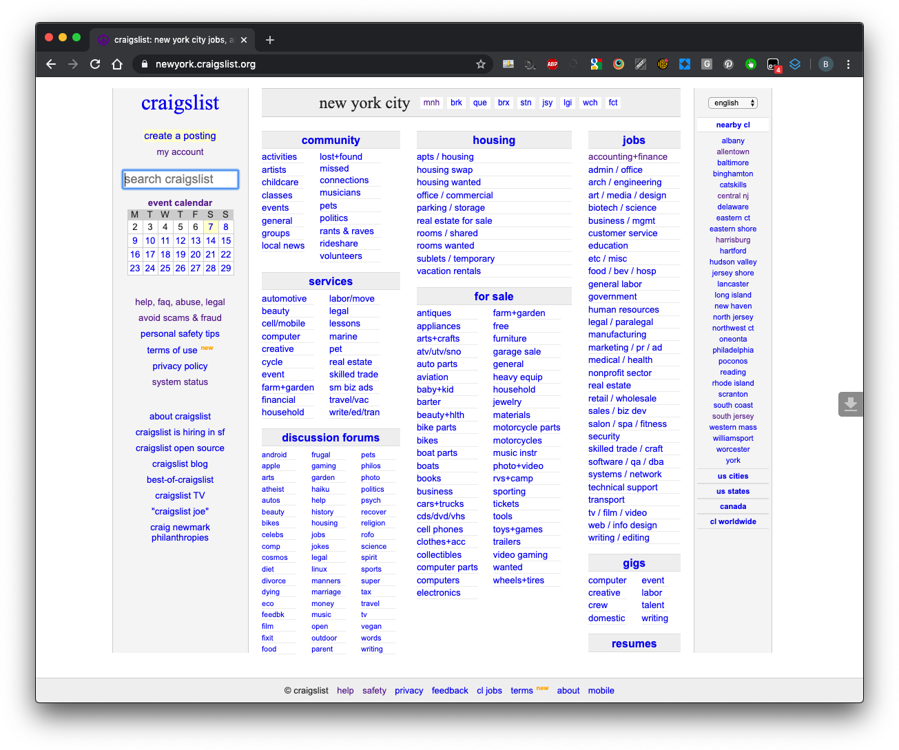
You can get just about anything on Craigslist. For example, you can buy a South Park pinball machine in Smithtown, New York, for a few hundred bucks. Thousands of posts are uploaded to Craigslist every day. It started in 1995 and is now in more than 700 cities around the globe. It’s the 19th most visited website in the United States. I decided to re-imagine Craigslist purely out of curiosity to see what a Web 2.0 version might look like. This is an academic exercise and not necessarily a pleading recommendation to gentrify what Jessa Lingel describes as an “increasingly lonely outpost in a hyper-corporate web.” Craigslist reminds us of the values of community, access, and democracy that thrived during Web 1.0. In fact, Jim Buckmaster, the CEO, states that few users complain about the design, “They complain about spam, they complain about fraud, they complain about the posting rules, they complain about the search, they complain about uploading images” (https://www.wired.com/2009/08/ff-craigslist/). Surely, Craigslist doesn’t need my help. It generates over a billion a year. Regardless, I’d like to take a stab at improving the user experience while paying respect to Craigslist’s ethos.
THE PROBLEM
Craigslist’s user experience sucks! The design is cluttered, and the features are limited. Users must muddle through a ‘clumbersome’ process to find what they are looking for. For example, when searching for a job, the user only has two choices – they can search by all categories (too broad) or one at a time (too specific). Also, the current UI doesn’t let users search the whole country or multiple locations but by one city at a time.
THE SOLUTION
Re-imagine the product and its UX to create a seamless experience that quickly and painlessly gets users to where they are going. I will focus on two user goals; improved search and reduced time on site.
DEFINING THE PROBLEM
The first step is to understand all issues fully. The best way is, of course, research. Because this is an academic exercise, there are certain research resources not at my disposal. These include data from the help desk, stakeholders at Craigslist, a ticketing system, etc. Some resources are simply out of scope, such as focus groups and scraping user groups. I will utilize competitive analysis. I will also look at what blogs, trade publications, and other media are saying to understand this audience’s thinking and what we can learn from them.
COMPETITIVE RESEARCH
I wanted to understand how direct and indirect competitive brands present similar content. I searched for inspirational material and engaging user experiences that could be applied to the Craigslist redesign.
Below are some platforms I reviewed for inspiration:
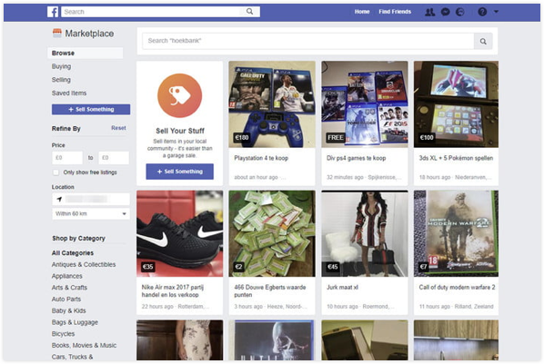
Facebook Marketplace
Marketplace brings a more visual experience in the form of galleries. It also puts a face and a name to each listing.
Locanto
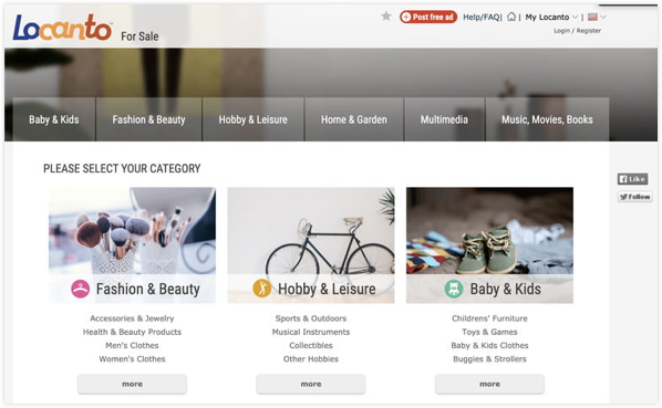
Locanto is basically Craigslist but with a far, far better interface. The search options will be very familiar to anyone who has used Craigslist. Still, they now feature more elegant menus, search bars, and buttons that make the whole experience far more enjoyable than Craigslist’s tiny text. Search by product, state, city, popular hashtag, and more — or set search alerts for what you really want to find. Likewise, the “Post Free Ad” option is easy and intelligent to use if you are willing to create an account or log in with your Google account. Like Craigslist, there are options to find everything from jobs and events to personals and houses.
OfferUp
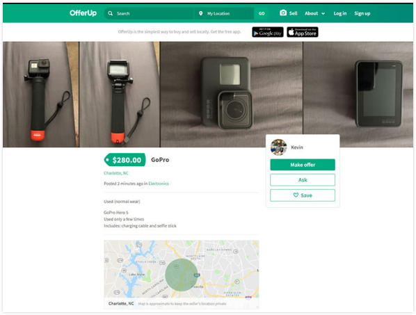
OfferUp is relatively new and has a helpful app available for both Android and iPhone. One of the favorite features is the haggle option, which allows you to negotiate a lower price with a seller. You can also keep an eye on specific items with the convenient “watch” feature. If an item hasn’t sold in a few days, you might feel more comfortable asking someone to lower the price. OfferUp also allows users to rate one another using a basic five-star system, enabling individuals to buy and sell more confidently.
RELATED MEDIA – BLOGS AND MAGAZINES
I searched Google for articles on Craigslist and found some great insights.
Why Craigslist Is Such a Mess – Wired
“They (users) seldom complain about amazing new features they imagine they might possibly want to use because they are too busy complaining about the simple features they depend on that don’t work as well as they’d like.”
Sellers Choice 2020 Marketplace Ratings: Craigslist – Ecommerce Bytes
“Managing listings and flaky buyers are a challenge, but easy to use for local selling.”
“You do not receive any notification that one of your items has been removed, you just have to notice it on your own. It is incredibly difficult to figure out why an item gets taken down.”
“The format is kind of old school.”
“It’s the wild west with CL. Communication from staff is almost non-existent.”
“Don’t like how you have to reload photos if you don’t catch the listing b/4 it expires.”
“The GUI (Graphical User Interface) is poor. Honestly, I haven’t used Craigslist since last year and have no desire to go back…not even as a buyer.”
INSIGHTS FROM RESEARCH
Well, Craigslist’s many types of users are unhappy with a lot of things. They are unhappy with the UI, searching, flaky buyers, scams, spam, and lack of customer support. We can’t solve all of these in this humble exercise, so I will focus on the user needs for improved UI and search.
FEATURE SET
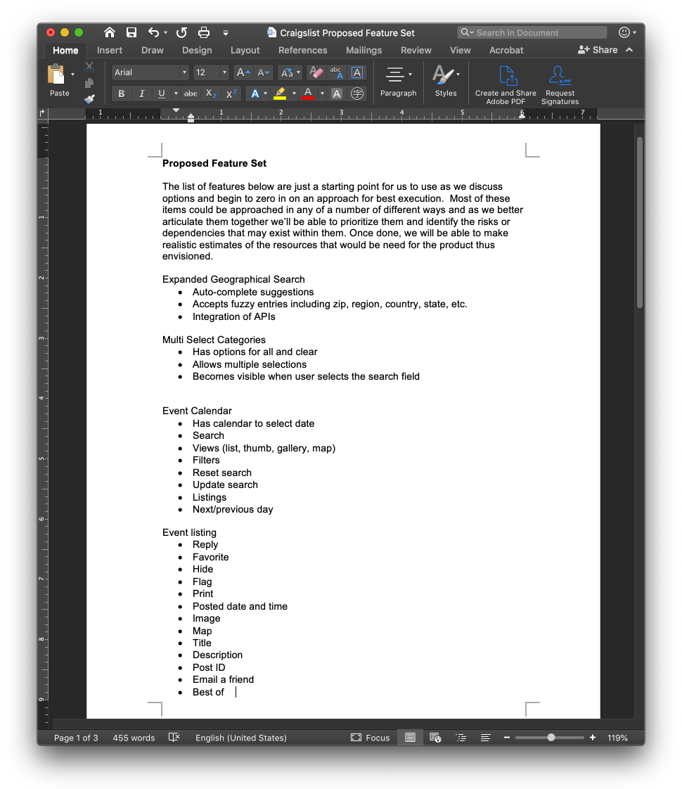
The next step is the all-important Feature Set. This memorializes all the proposed features. This is essential to mapping out the overall architecture. Below is a screenshot of the Word document I used to capture the entire site requirements.
PERSONAS

To focus on one use case, I’ve created the persona of James. He’s worked in the medical field for 18 years selling. He’s worked primarily in Bio-Tech.
NAME
James
AGE
52
STATUS
Single
EDUCATION
Law
Occupation
Medical sales
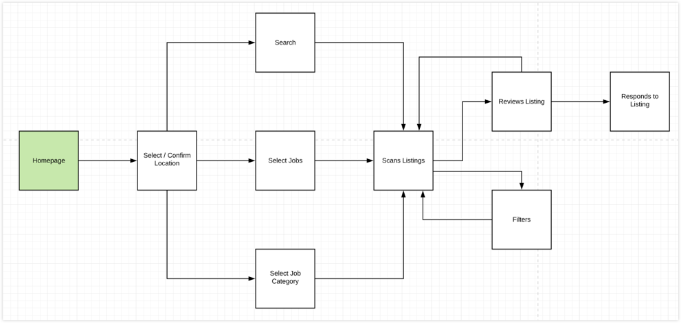
I wanted to see what steps James would take to find a listing on Craigslist. The idea is to gain insight into the current process and look for ways to improve it.
USE CASE
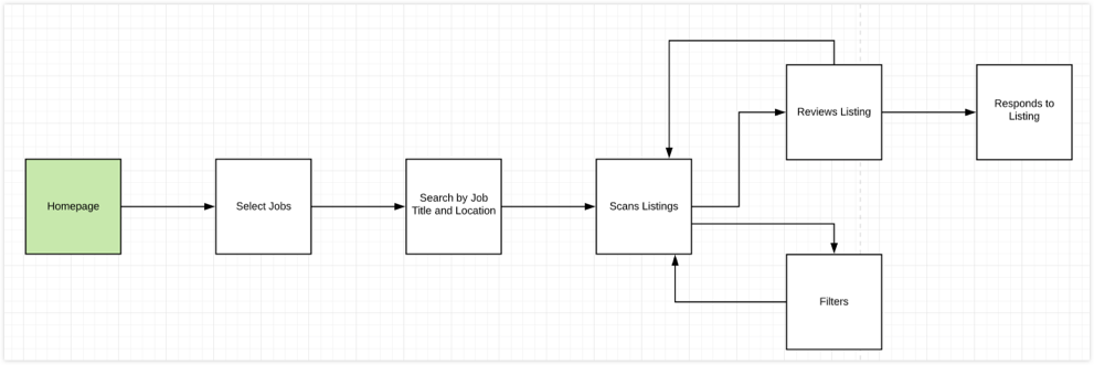
The flow diagrams below represent the current and proposed process for finding a job listing. By removing the need to select a location first, the process is reduced.
CURRENT PROCESS
PROPOSED PROCESS
CARD SORT
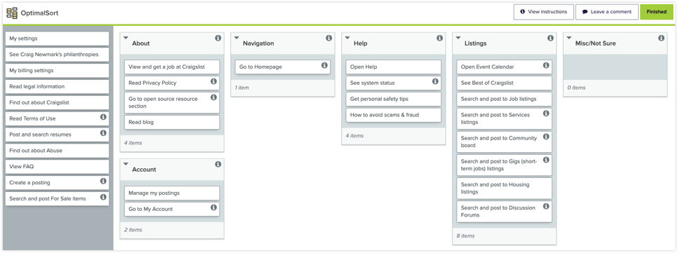
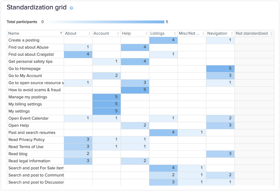
To gather some insight on taxonomy, a simple card sort study was conducted using OptimalSort. Most of the exercise’s value came from getting a better understanding of what users would expect to find in the Help and About sections.
OPTIMALSORT ONLINE SERVICE
STANDARDIZATION GRID
SITE MAP
Although only focusing on one user journey, it became apparent that an understanding of the current site map and taxonomy was important. If I can find ways to reduce the site’s complexity, that will directly benefit the user journey I’m working on.

‘NAPKIN’ WIREFRAMES
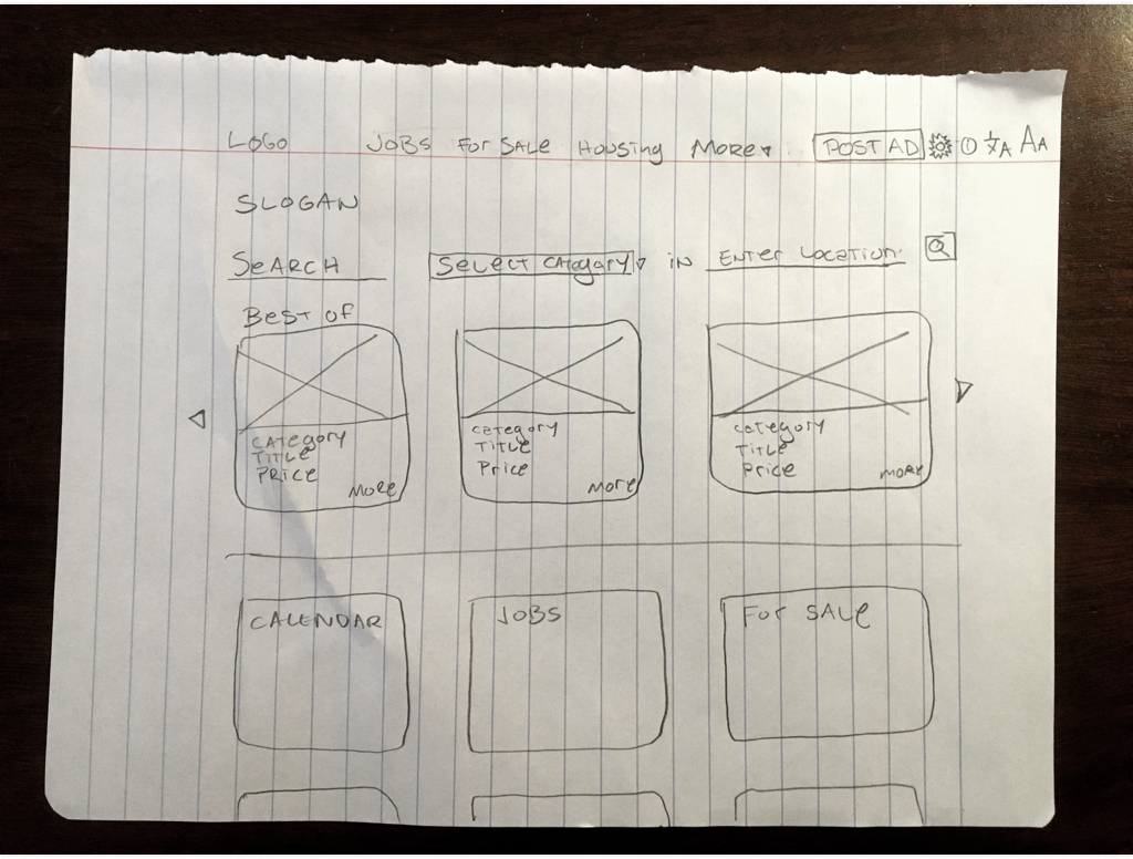
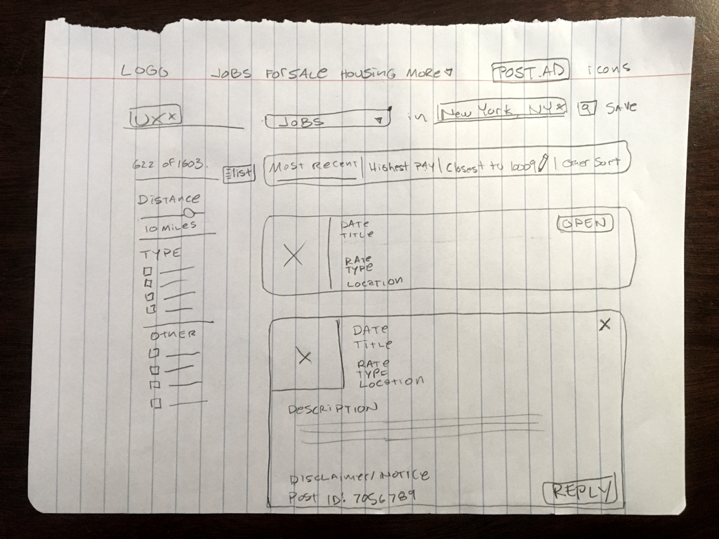
With all that I’ve learned so far, I decided it was time to put it down on paper. I wanted to be true to the 80-20 rule and only present the essential 20% of items. For example, only the most used listings categories are shown in the navbar. The remaining lists are available through the More button. Search has been made most important and has evolved to accept more than just individual cities. Listing categories have also been demoted to filters in the search results.
HOME PAGE SKETCH
RESULTS PAGE SKETCH
HI-FI WIREFRAMES AND PROTOTYPE
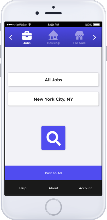
With tools like Sketch and Invision, it is so easy to design and prototype that I decided to skip classic gray-scale wireframes. There are some design elements, but these should not be mistaken for the final visual design. The two wireframes represent the use case of a person searching for a UX job. The InVision prototype allows you to explore these interfaces further.
DESKTOP PROTOTYPE
HOME PAGE

RESULTS PAGE

MOBILE HOME SCREEN
VALIDATING THE HYPOTHESIS
From a product standpoint, I would look at user behaviors. Are they eating the dog food? The KPIs may include items like engagement levels, postings, and sales.
From a UX standpoint, I would like to conduct A/B or split testing and user testing.
For this project, I decided to start with the ‘Mom Test,’ where I show the hi-fi wireframes through InVision and Zoom to my mom and see if she can figure it out. If Alanni finds it easy to use, then it’s safe to say, as a rule of thumb, most people will. Some areas confused her, and I took note. I then involved four other participants to walk through their experiences and take notes of any pain points. There was universal agreement that some of the UI was confusing. This included the search bar and view options (list, thumbnails, map) on the results page. These issues were addressed in a design iteration. When presented to additional participants, the pain points disappeared.
